Module 4: Creating Matricies and Bar Charts
Start off with a Matrix. What is a Matrix? It's basically just a pivot table. It also allows you to "drill" into the data.
A matrix is useful when you want to show grouped data in rows and columns, similar to Excel pivot tables. It is great for comparing categories across time or across other dimensions.
You can select:
- Rows
- Columns
- Values
What goes in what? It doesn't matter. It's up to you. The longer (character and data length) things go down.
This is important because if you place a long text field like a region name in columns, the matrix can become too wide and hard to read. Usually, place categories with more text or more values in rows and keep the dense values or dates in columns only if needed.
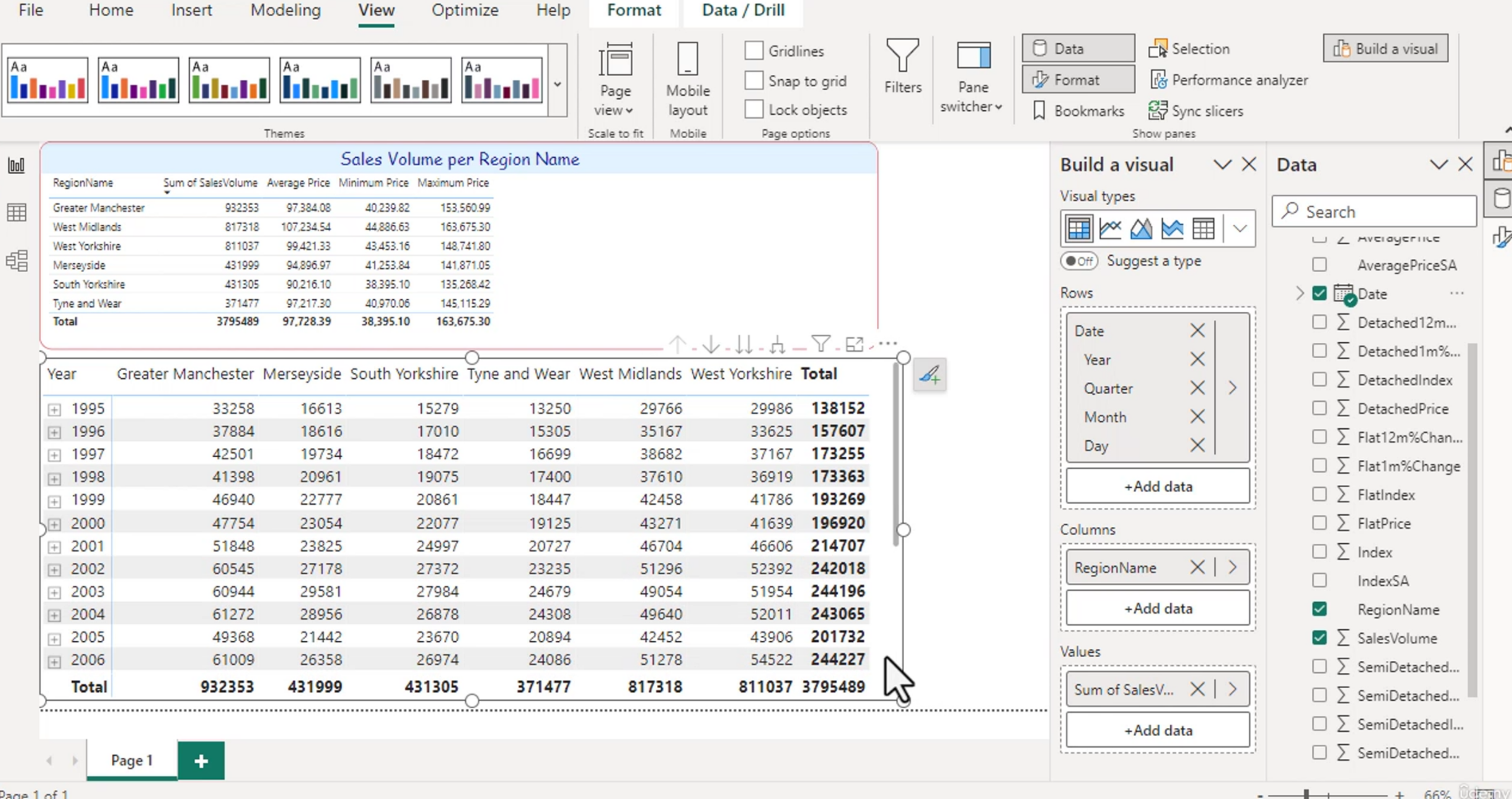 What you don't want is a date that goes across the page and off. You want to scroll down.
It's better to make the matrix tall rather than wide so the user can read through the categories without the visual becoming too wide on the page.
You already know how to format based on Module 3. But...
What are all of these icons?
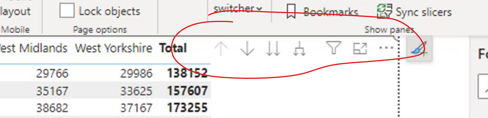
These icons are part of drill and expand behavior in Power BI.
- Drill Up: Allows you to move back to a higher level of the hierarchy, such as going from month to year.
- Drill Down: Allows you to move into a lower level of the hierarchy, such as from year to quarter or from month to day.
- Expand/Collapse: Lets you reveal or hide child categories inside the matrix.
Notice how you can drill from a year date into a specific day.
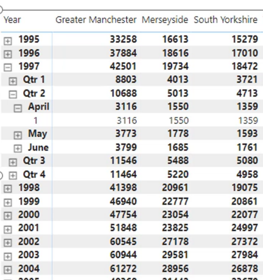
This is a really useful feature when your date hierarchy has year > quarter > month > day. It makes it easy to explore the data at different levels without creating multiple visuals.
Note: The Visual Table option is not great with Matrices - great for bar charts though.
Bar Charts
A bar chart allows you to visually see the table in a more compact and readable format. It helps when you want to compare values across categories.
Drag the date into the legend and each color represents a particular year. You can still drill into the data if you want.
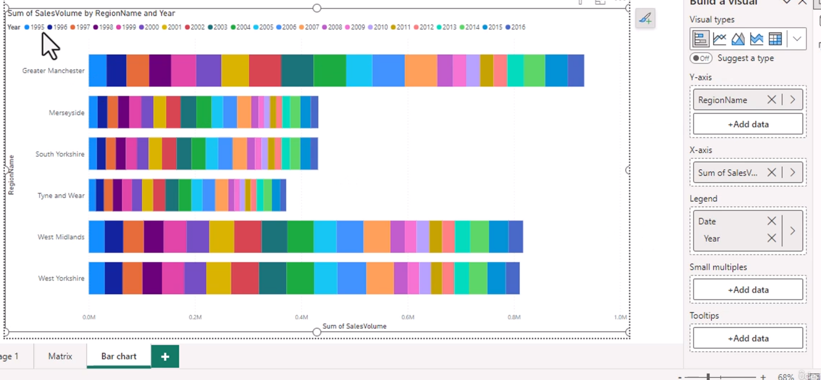
This makes it easy to compare a single category across time in one visual.
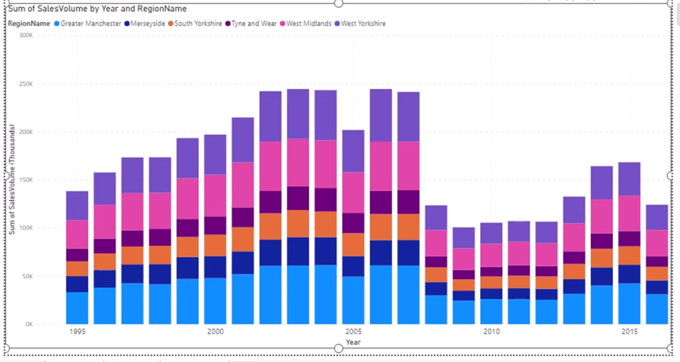
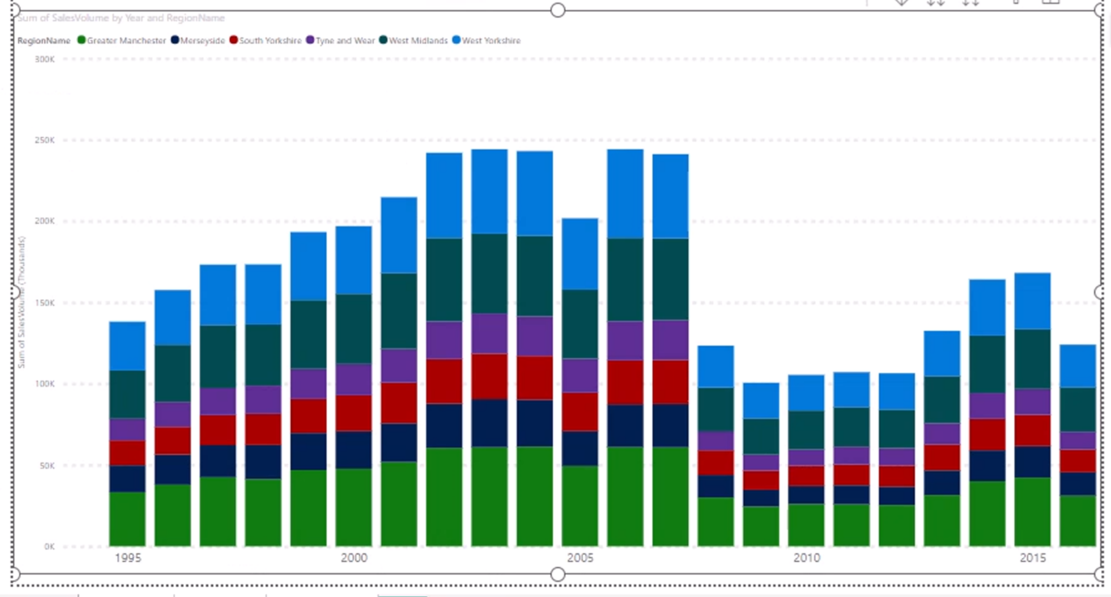
Switching the theme gives me the ability to have entirely different color swatches across the entire visual.
Themes can help with consistency and branding, and they can also make charts easier to read by providing a good set of color combinations.
Example 1:
Example 2:
You can also change the transparency and the border as well, just for fun.
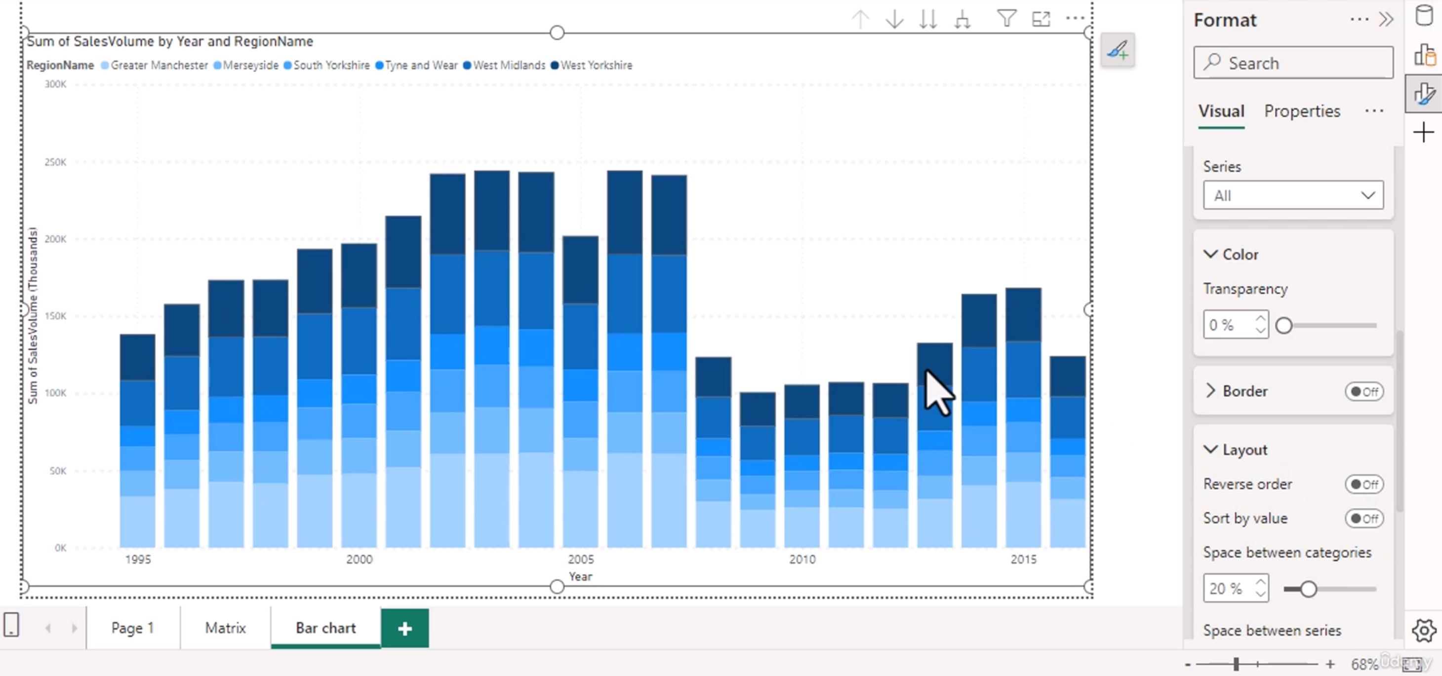
This can help with readability, but do not overdo it. The goal is to emphasize the data, not make the visual noisy.
Note: Use the series explosion button sparingly because it makes the bars higher and might throw off the x axis values.
Sometimes a little space between series helps readability, but if you explode too much, the chart becomes visually distorted and can make comparisons harder.
Themes
You can import themes as well, but this is for advanced users. You can play with it if you want.
Power BI themes can be saved and reused across reports, which is helpful for consistency. You can create your own or import a theme file with defined colors, fonts, and visuals.
Bar Chart Formatting - Continuous vs Categorical Axes
You can add in the numbers into the data like so:
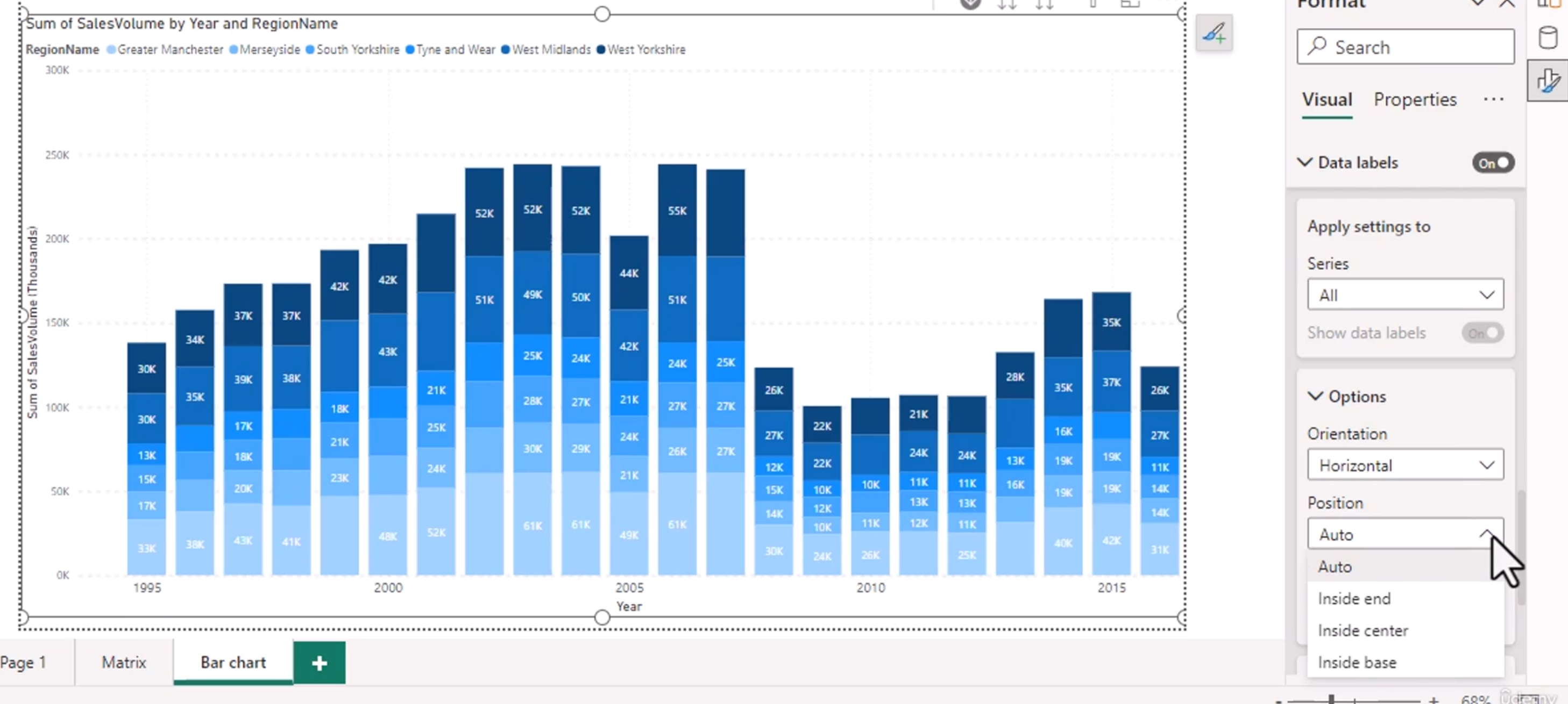
But some of the numbers are not showing, so you can change the label density up or down.
This is a common issue in dense charts. If labels overlap or disappear, you can:
- change the axis type
- reduce data density
- increase the visual size
- adjust label density
- format the axis to show fewer labels
A continuous axis is usually better for time values and numeric data trends, while a categorical axis is better for non-numeric categories like region or product name.
The key idea is: if you want to see a trend over time, use a continuous axis; if you want to compare separate groups, use categories.
You can also adjust the number of displayed labels and the axis type to make the chart easier to interpret.
Configure Interactions
If you click on one item in a table, the other visualization will be affected.
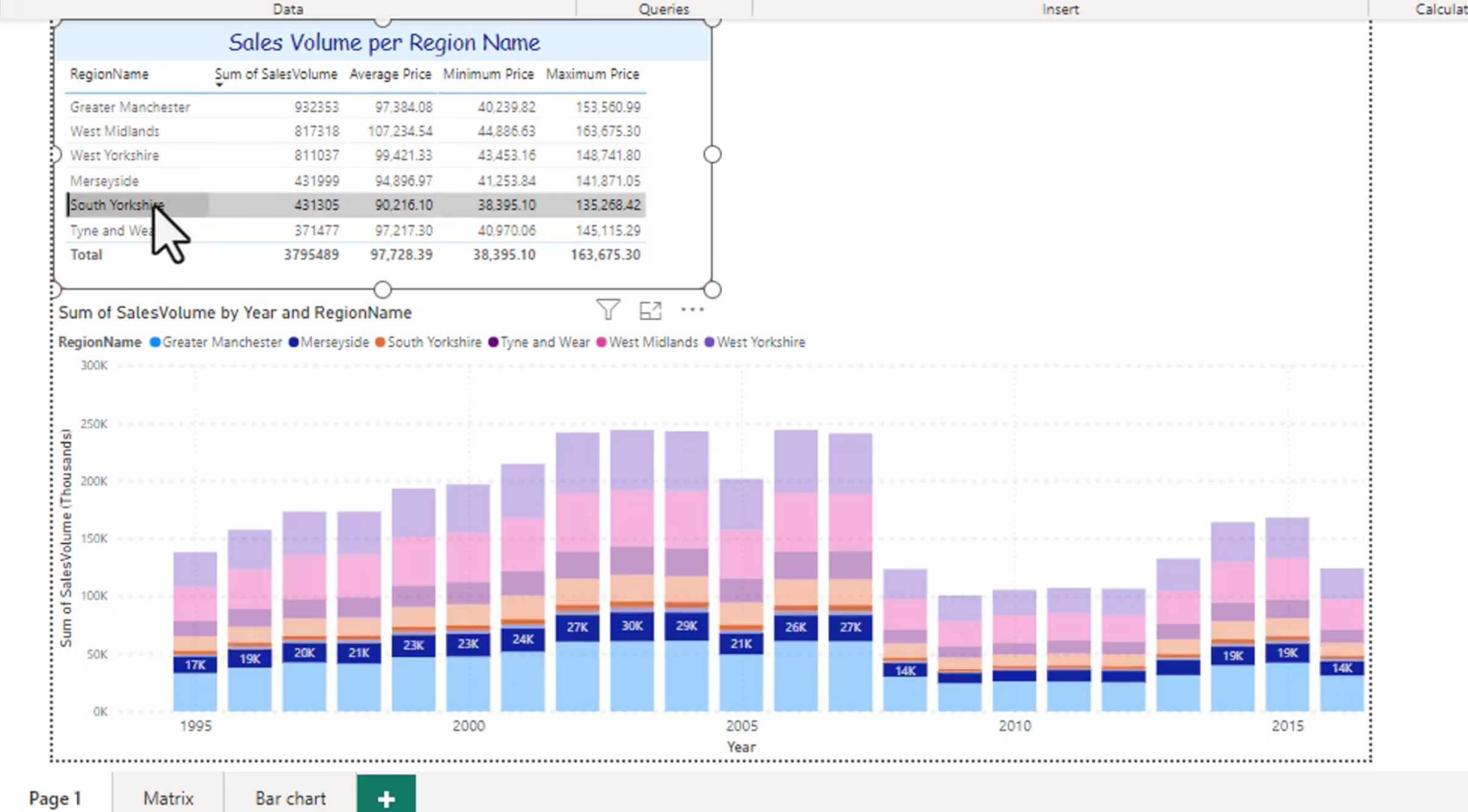
This is the interaction feature in Power BI. It allows different visuals to cross-filter or highlight one another, which is useful for dashboard exploration.
For example, if you click a region in a table, other visuals on the page can update to show only that region.
Note: Only one selection occurs at once. You can't click on Tyne and Wear on the left, then click 2000 on the right and expect the graph at the bottom to be accurate.
This is a good reminder that interactions are context-sensitive. If one visual is selected, another selection may override the filter instead of combining with it unless you use Ctrl or adjust the interaction settings.
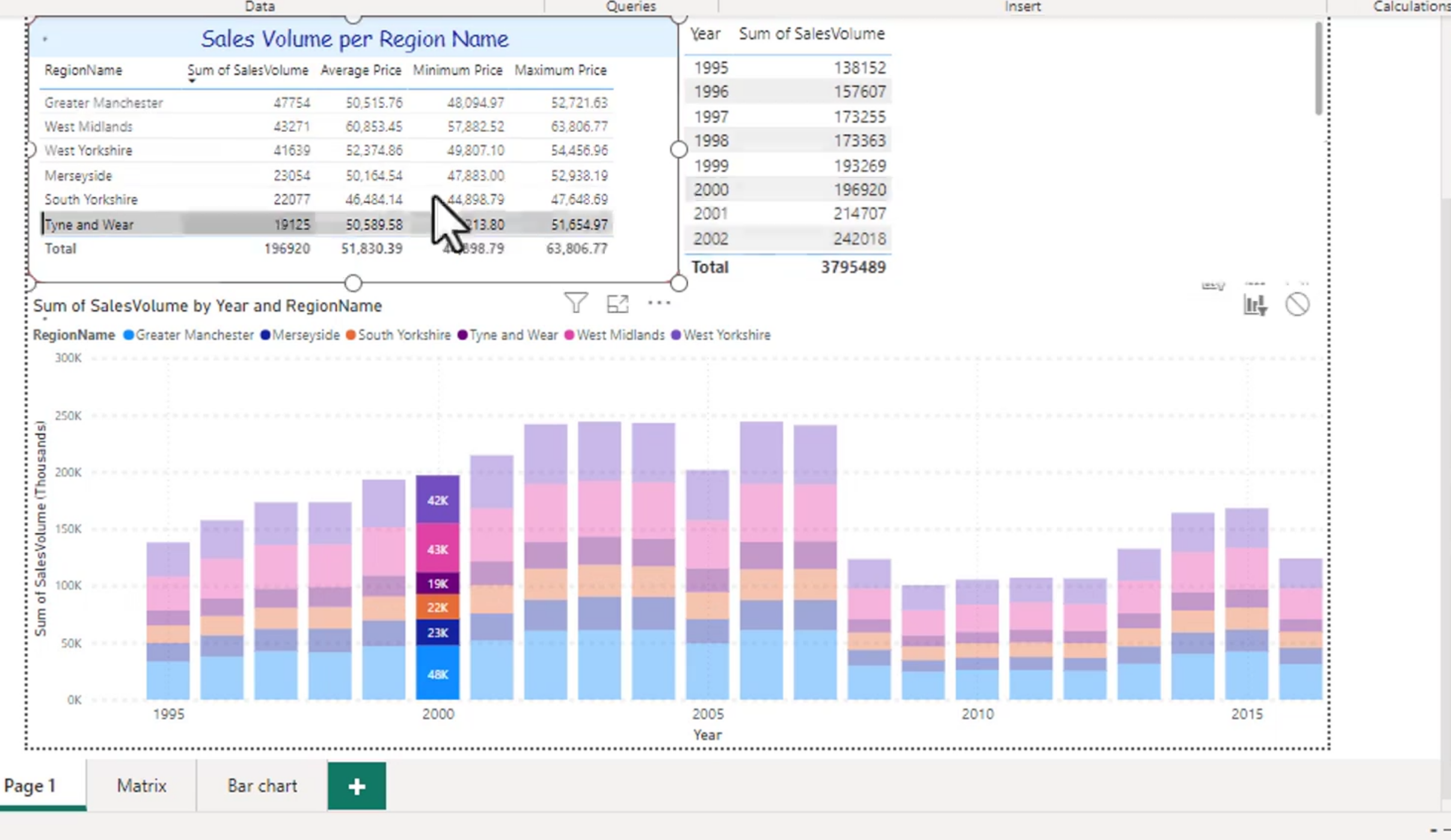
Make sure you space your visuals accordingly, you don't want to hide icons.
When designing a report, layout matters. If visuals are too close together, users may accidentally click the wrong element or hide important controls.
Think: what do you want your page to do when you click on something.
This is the design question behind interactions. You need to decide whether clicking a visual should:
- filter other visuals
- highlight data
- do nothing
- drill into the hierarchy
Tip: You can use the CTRL key to select more things. You can't use Shift to select a range tho.
This is useful when you want to make multiple selections in a slicer or on a chart, though it behaves differently depending on the visual and the selection mode.
Clustered and 100% stacked bar charts
A clustered bar chart places categories side by side for easy comparison.
It kinda does this:
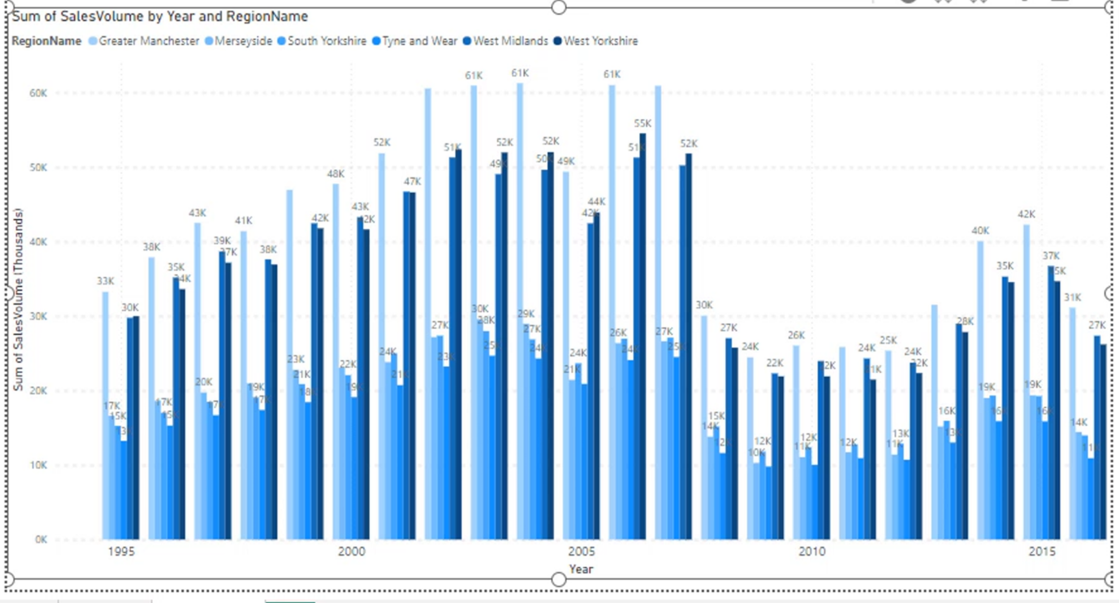
This works well when you want to compare categories across a fixed set of groups.
TOO MUCH INFORMATION is bad. Drilling into it might be more appropriate.
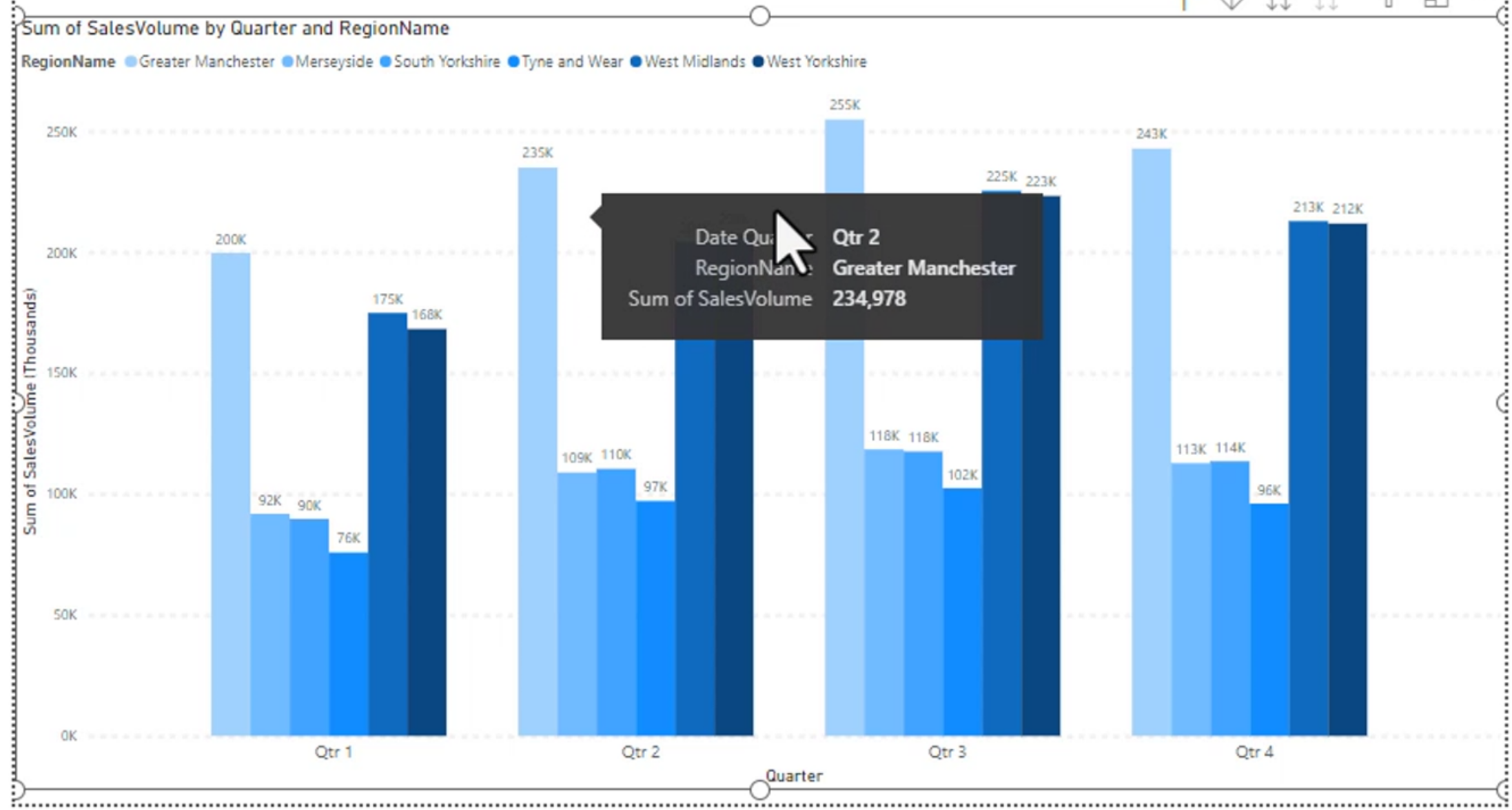
If a chart becomes too crowded with too many categories, the readability suffers. In that case, drill down into the data level or split the chart into multiple visuals.
A 100% stacked bar chart shows the composition of each category rather than the absolute totals.
100% stacked looks like this:
From:
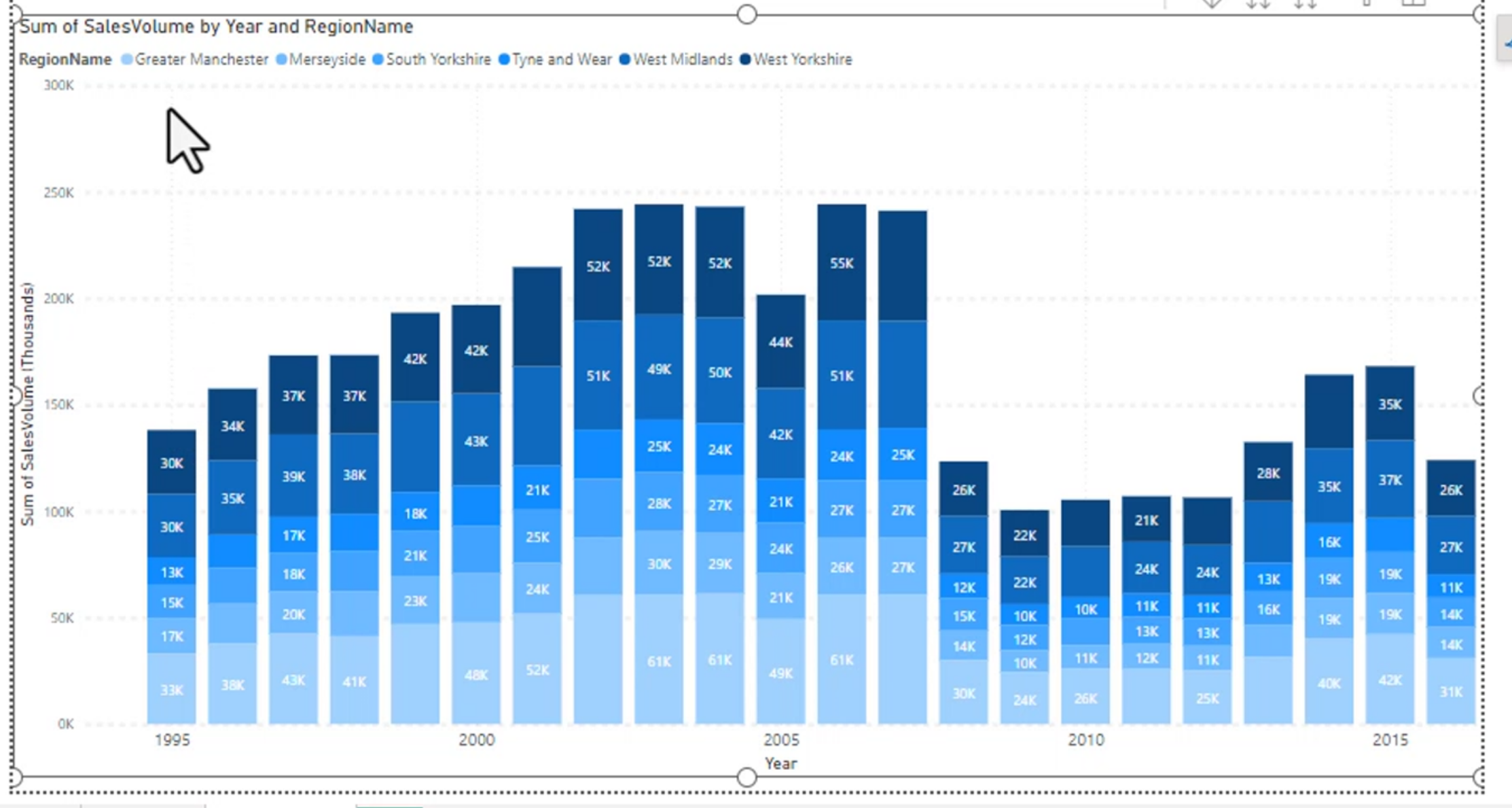
To:
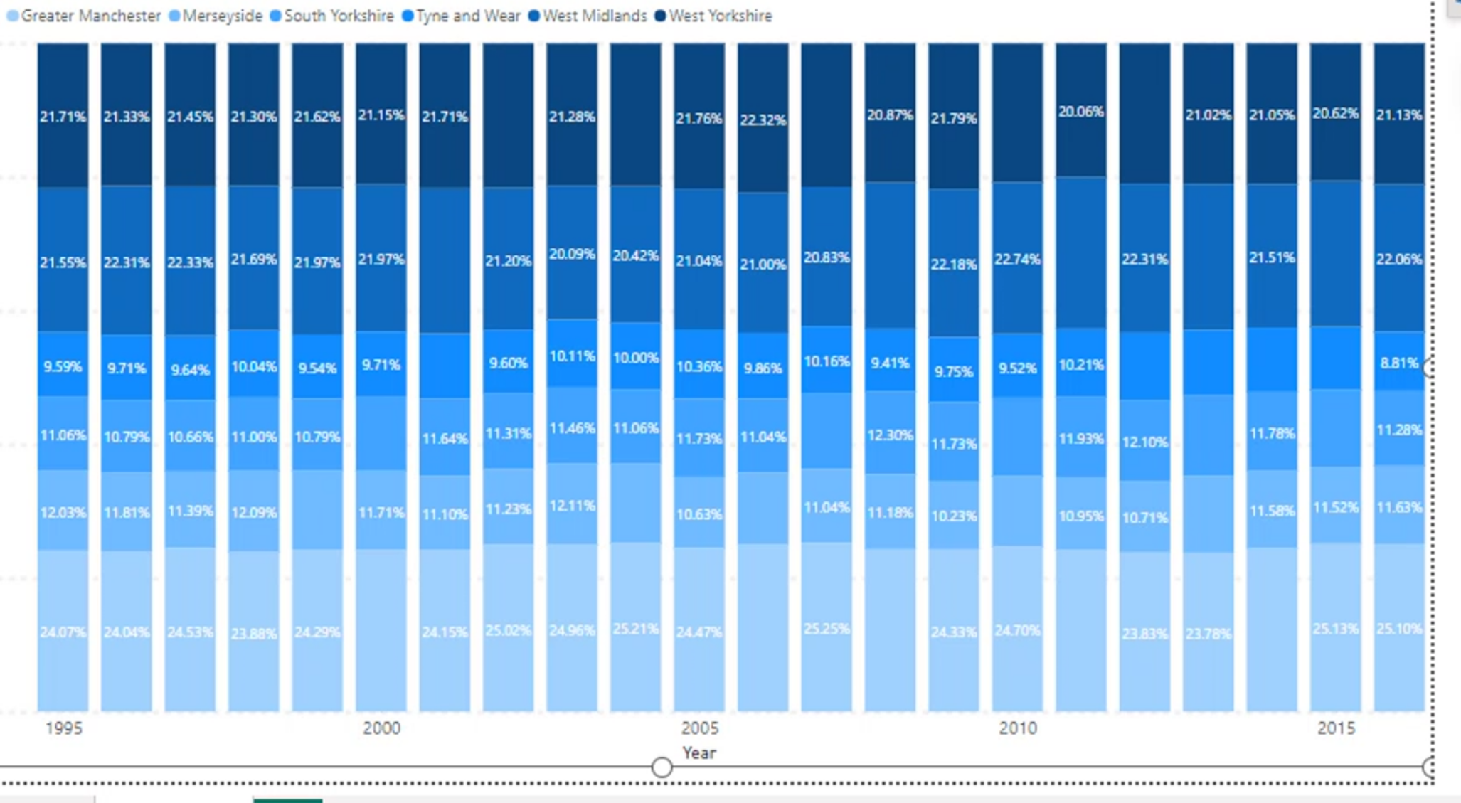
This makes each bar represent 100% of the total, which is great for showing proportions. However, it is harder to see trends over time compared to a regular clustered bar chart.
This is because the stacked percentages normalize the values, so the actual magnitude is hidden.
Line and Area Charts
This is a line chart. Kind of like a trending line different than the bar chart.
The idea is to simply show what and where the values are. You probably don't want similar colors for this one.
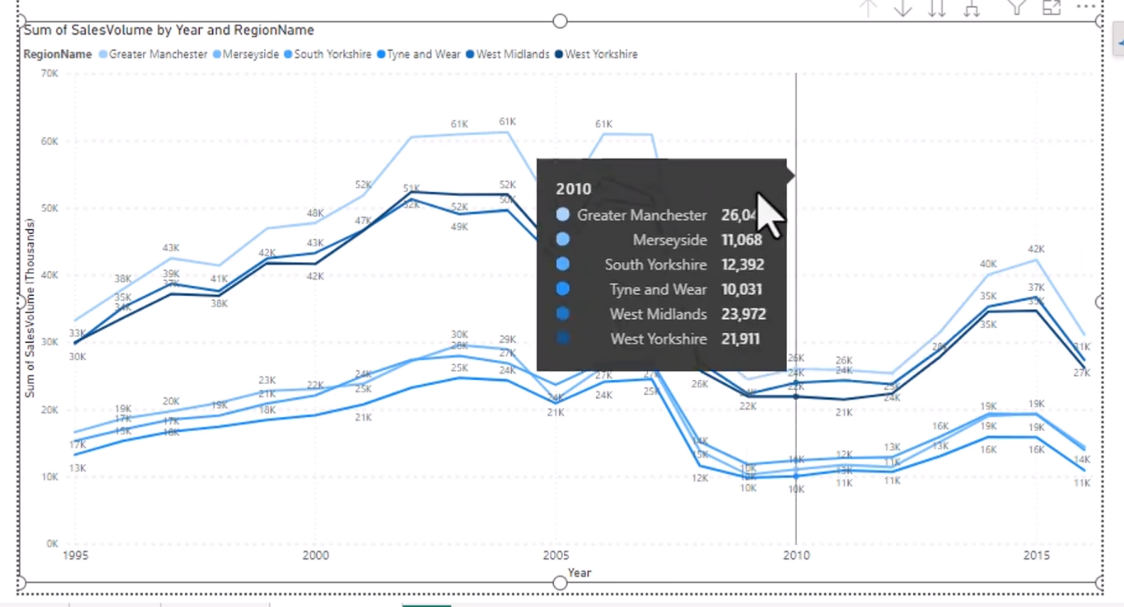
A line chart is best when the story is about trend, rate of change, or progression over time. It is usually less useful when you need to compare lots of categories at one moment in time.
A stacked area chart would look similar, but more of a cross between the stacked bar and the line.
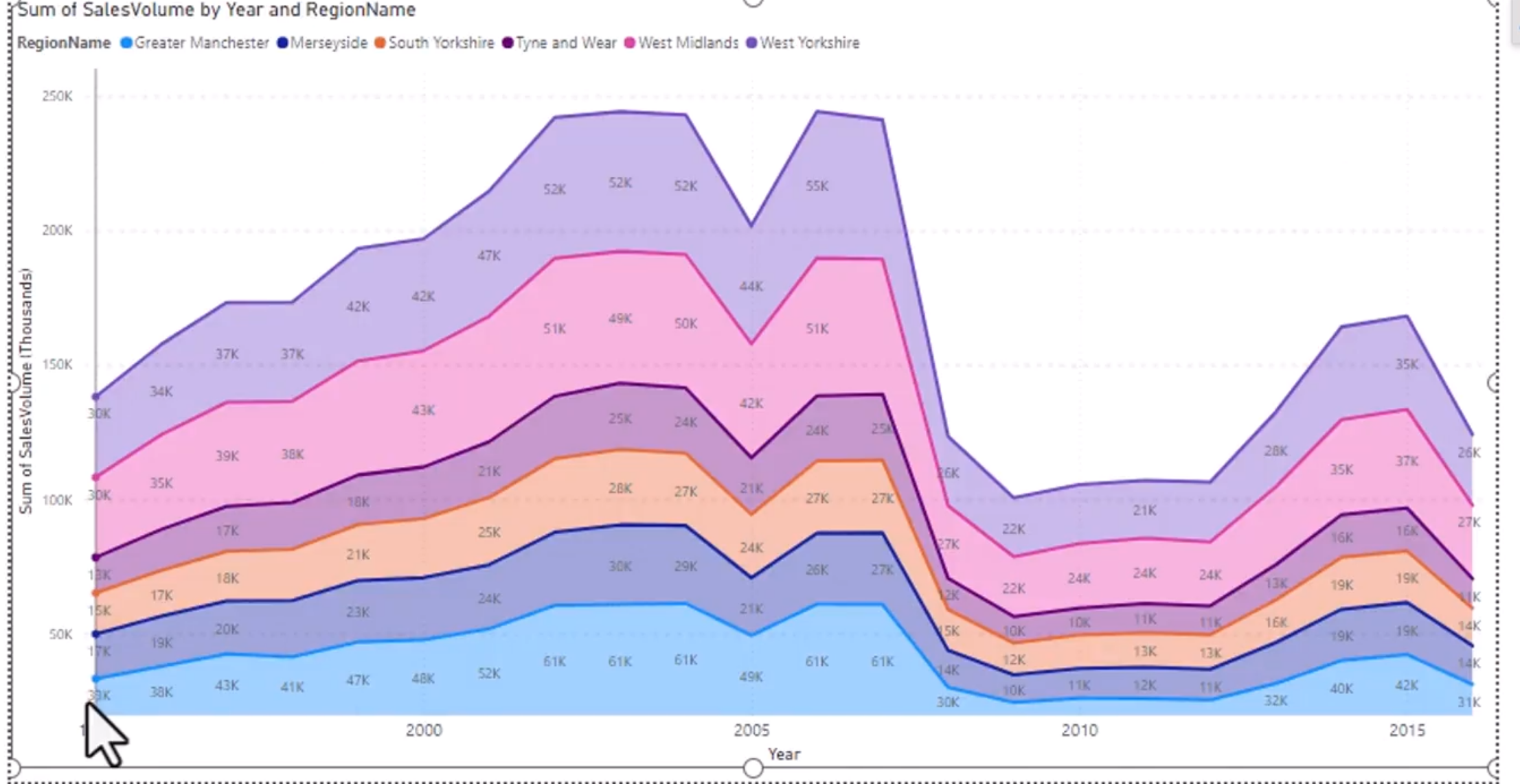
This is useful when you want to show both the total and the breakdown of each component over time.
Stepped looks pretty cool as well.
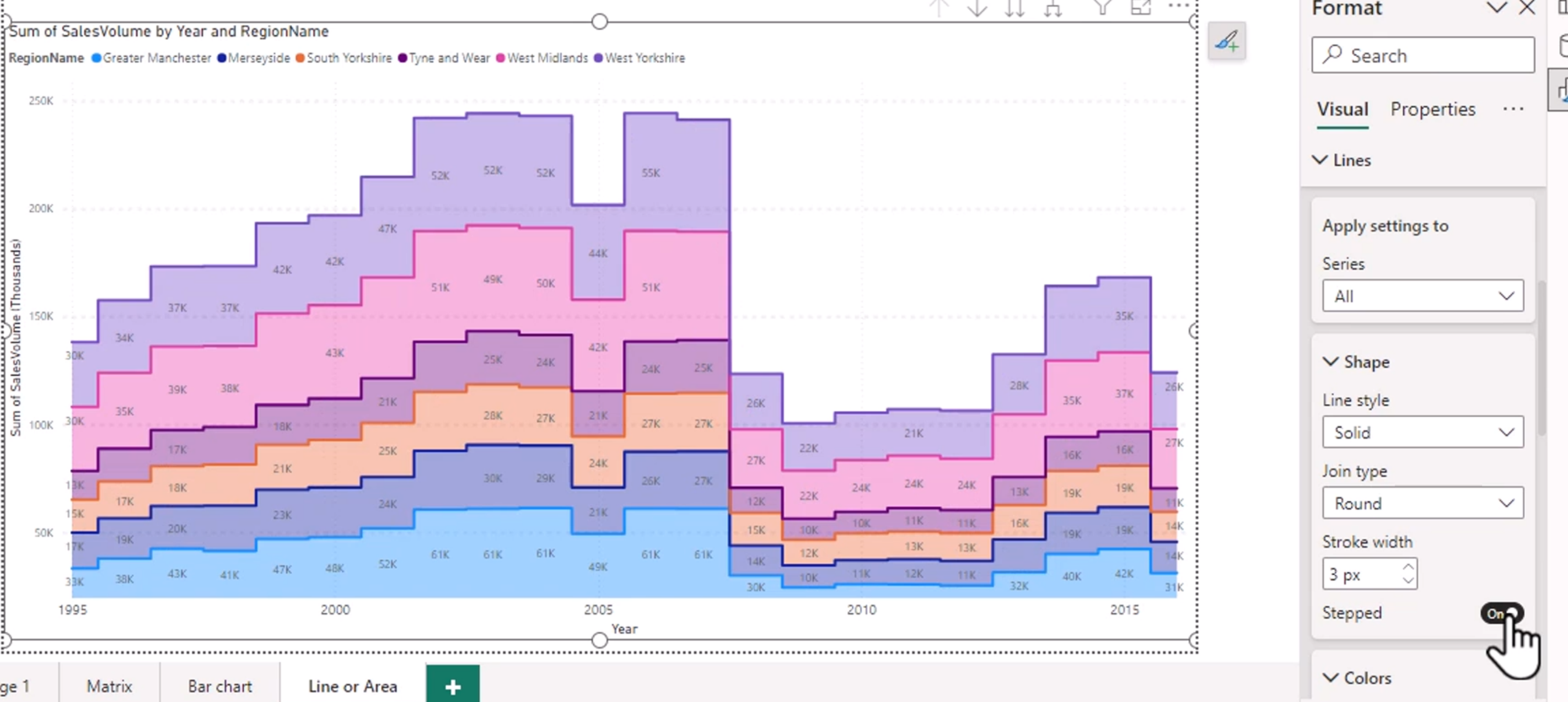
A stepped line chart changes value at specific points rather than using a smooth continuous line. It is good when you want to emphasize that a value changes at defined intervals rather than gradually.
What about a stepped line chart? You can select one to be stepped.

Markers
Markers are dots, squares, or other shapes placed on the line chart to make the data points easier to identify.
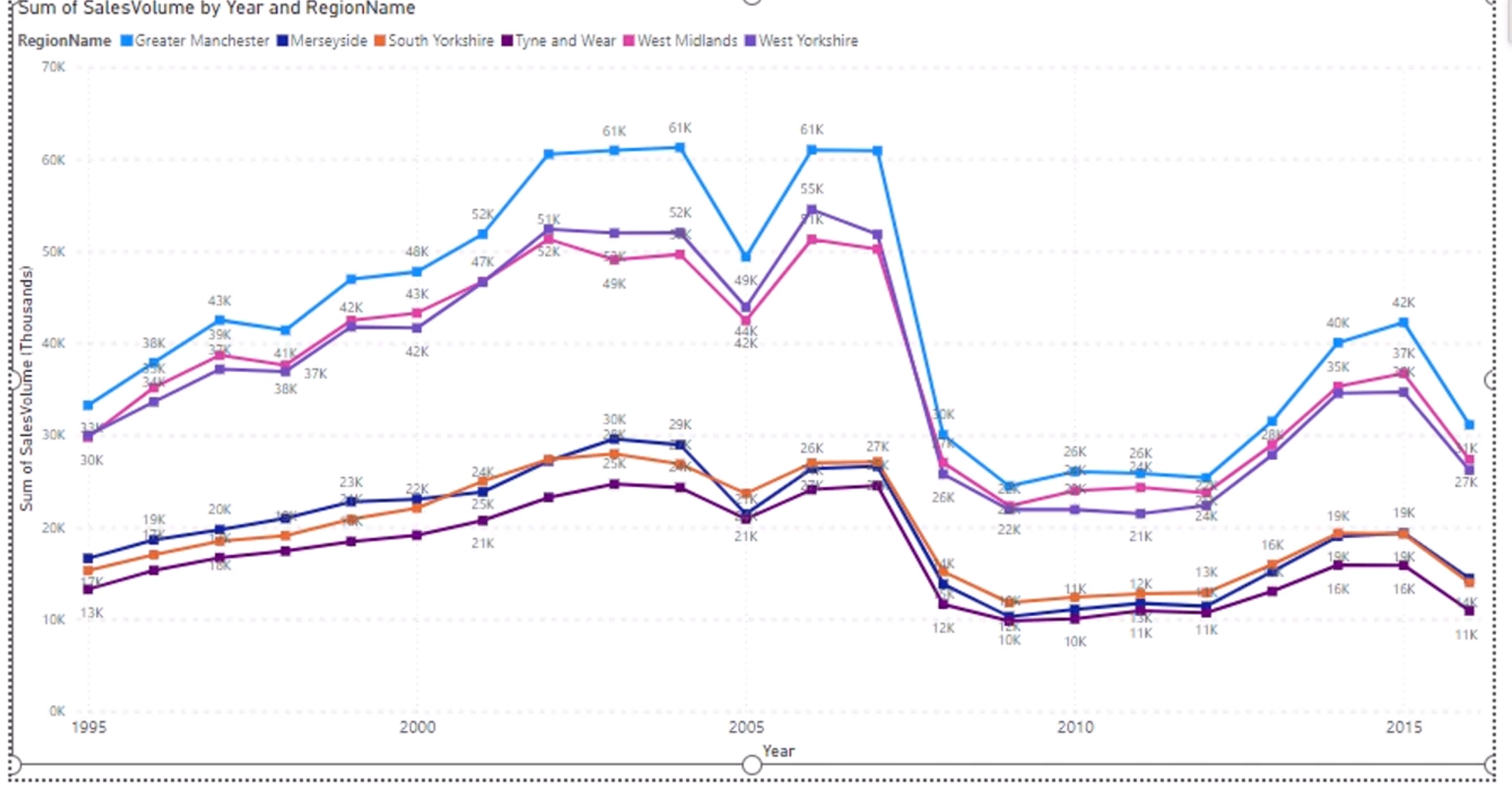
This helps users quickly see each point, especially in dense charts or when a line crosses multiple values.
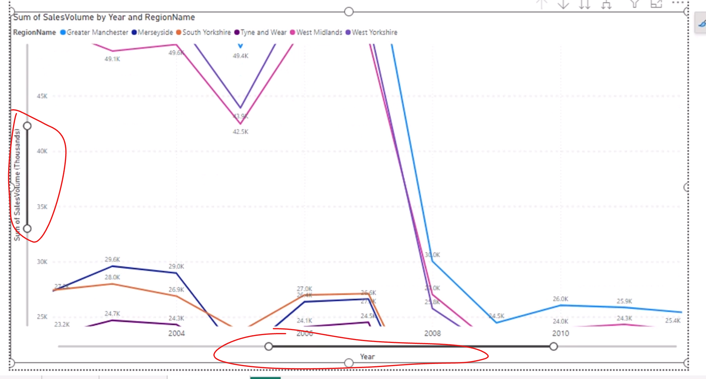
Zoom Slider
A zoom slider lets you focus on a smaller time range or a specific part of the visual. This is handy when you have lots of data points and want to zoom in on a relevant period.
Combo Charts
You can have a line and a column on the same chart. This is called a combo chart.
ghost like example:
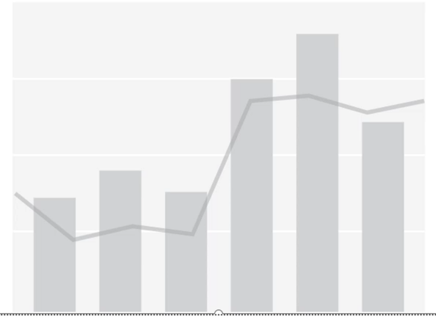
A combo chart is useful when you want to compare different scales or types of measures at the same time. For example, one axis might show revenue as columns while another shows profit margin as a line.
Again, make sure that you don't have too much information:
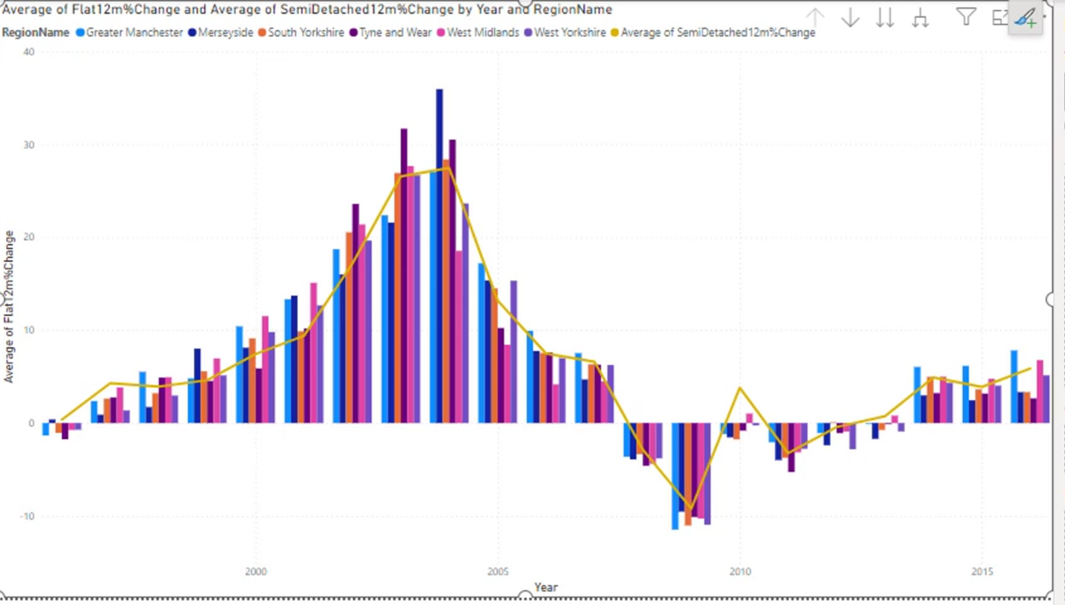
This is a good reminder that multiple series and multiple axes can make a chart cluttered very quickly. Use combo charts only when each series adds value.
Data labels get messy as well.
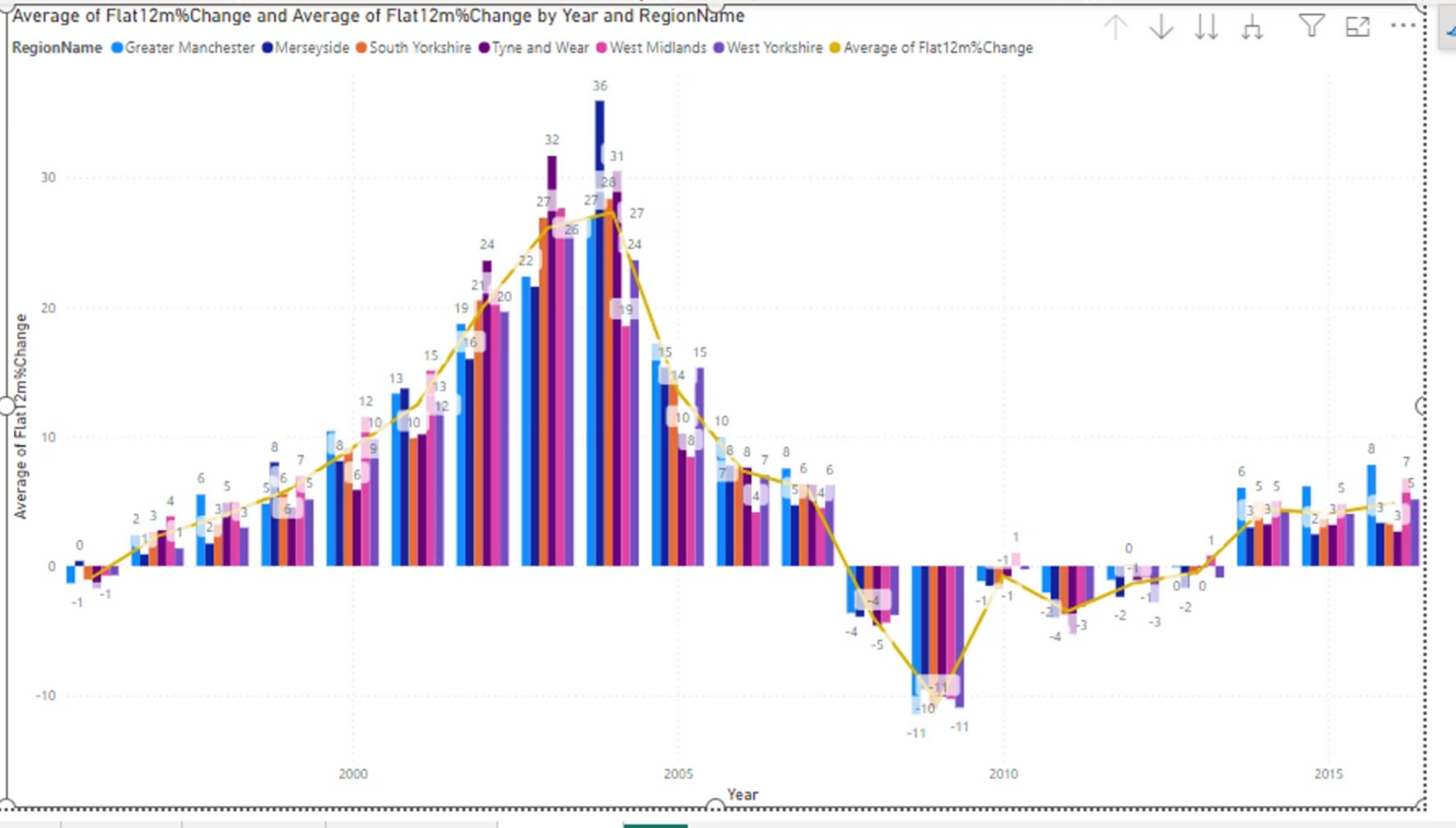
When there are too many labels, the chart becomes harder to read. Usually, remove or simplify labels unless they are essential to the story.
Sparklines
A sparkline is a tiny, high-level trend visual that is often embedded in a table or a small dashboard area. It is useful when you want to show a trend without taking up a lot of space.
A sparkline is often used for quick visual scanning, such as comparing sales trends over time in a compact table.
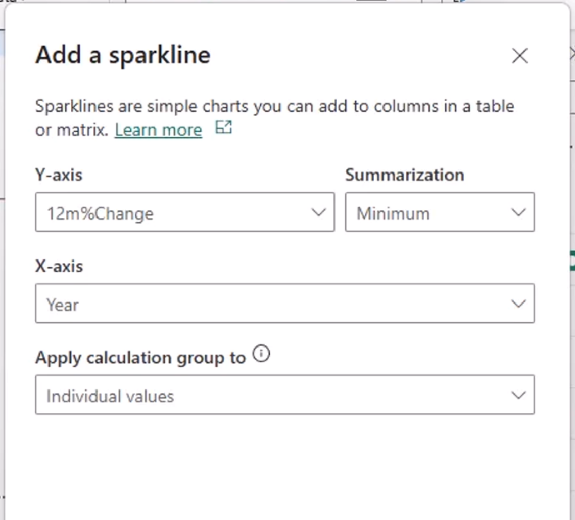
It can provide context very quickly, especially when you are already looking at a grid of numbers.
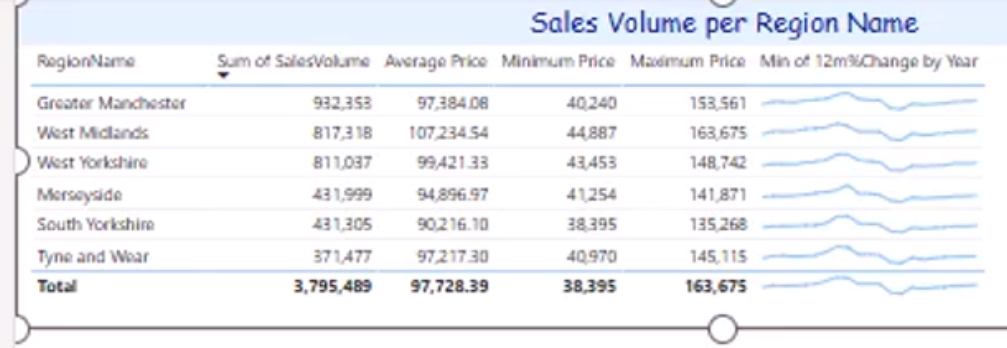
In short, sparklines are compact trend indicators that add context while keeping the layout clean and space-efficient.